


Join our Telegram channel to learn more!
The idea behind UX design is simple: happy, confident users are more likely to buy from you. They’re more likely to trust you, sign up to your mailing lists, or download your app.
I often think of user experience design (or UX design) as psychology rather than development.
Good UX design is all about getting inside the head of your visitors.
It’s anticipating their every move, and creating a website that is simple, intuitive and enjoyable to use.
Unfortunately, there is no easy answer or silver bullet for good UX design. It’s the culmination of lots of tiny tweaks. Each one improving the experience on your website.
With that in mind, I’ve rounded up a checklist of 25 small (and easy) tweaks that will make your UX design shine.
Website speed is your very first chance to make a good impression. It’s your first UX hurdle.
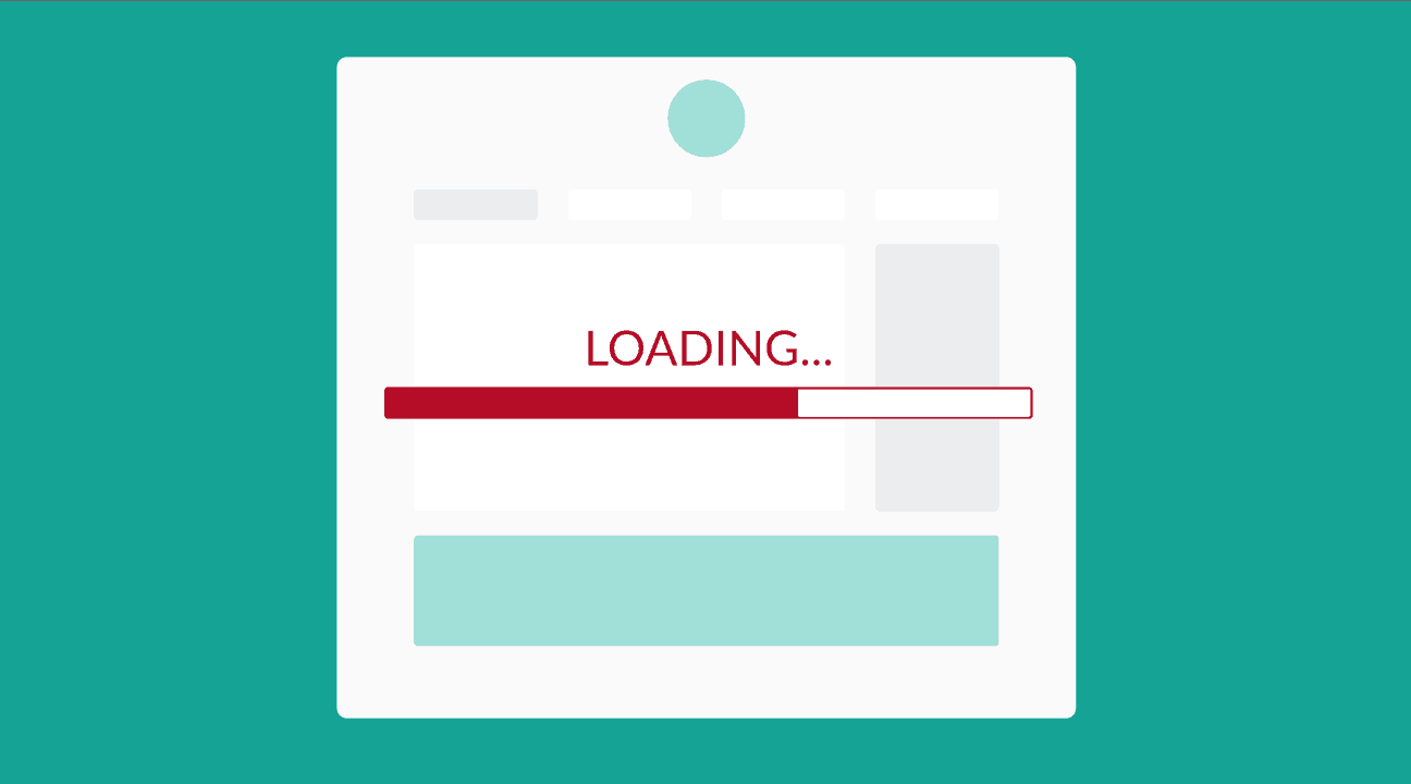
Too slow and your visitors are already agitated and less likely to trust you. We instinctively associate speed with professionalism, and most visitors expect your website to load within two seconds.
Anything slower than that, and it’s a poor user experience, right from the start.
Make sure your server speed is up to scratch, and slim down the weight of your site so it pops open quickly.
Your next big challenge is quickly informing your visitors. Who are you? What do you do? And what value can you give them?
This is called a value proposition, and it’s so important we wrote an entire blog post on it. You’ve only got a few seconds to convince your visitors, so make it count!
Try it now: summarize your entire website in one sentence and signpost where you want visitors to go next.
A core part of UX design is eliminating any worries or anxieties your visitors might have.
One of the biggest worries for new visitors is whether they should trust you or not – especially if you’re a new website.
One way to remove this anxiety is by showing them there’s a real person behind the scenes. Add a business address, a phone number and a real email address. (NOT a contact form – people tend to distrust them compared to a straight-up email address).
Even better, use a live chat box so users can instantly ask questions.
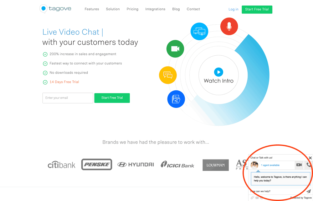
If something goes wrong, it’s good to know they can easily get in touch.
We’ve all gotten lost on websites before. You follow links and end up down a rabbit hole.
If this happens, your visitors become agitated and frustrated. They’ll instinctively hit the “X” button to close the browser.
Instead, make sure there’s a clear and defined ‘home’ button, so they can always start over. Typically, users expect your logo to link back to the home page too, so make sure it does.
As well as giving them a quick restart, use ‘breadcrumbs to explain where they are in the process.
Large progress bars are great for this. If it’s during the checkout process, for example, let your user know exactly where they are, and what’s left to do.
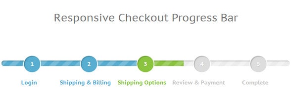
Again, this is simple psychology. For example, going for a walk is much more tiring when you don’t know where the end is. We feel much more comfortable when we have a map. The same idea applies online.
It’s super frustrating inputting the same data twice on a form (like a billing address and a shipping address). Try to get rid of any repetitive actions that slow the purchasing process.
It’s things like this that lead to cart abandonment. Your visitors will look elsewhere.
Even better, create a system that remembers your customers’ preferences. It will surprise and delight them when it’s all there waiting for them again. It’s a simple thing that improves the chances of return customers.
Some of your visitors will be regulars. They’ll blast through your signup sheets and purchasing process. Others will be brand new, and they might have some questions along the way.
Little ‘tool-tip’ icons (often identified with a question mark) will help the newbies understand what they need to do. But at the same time, they don’t get in the way of your experts.
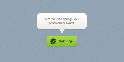
You can even provide shortcuts or fast-tracks to help speed up the experts. You’ll often see ‘skip this’ links on most website and app explainers, for example.
A call-to-action tells your visitor exactly what to do: ‘Sign up’ or ‘Buy now’ for example. Make sure it’s commanding, straightforward, and explains the value of doing so.

Better yet, make it a clear, bold color (greens and oranges work wonders here), and surround it with white space. That should draw your users’ eye straight to it, giving them a clear indication that this is what you want them to do.
With a lot of calls-to-action, you’ll see two options. ‘Submit’ and ‘cancel’ for example. Or ‘download now’ and ‘free trial’.
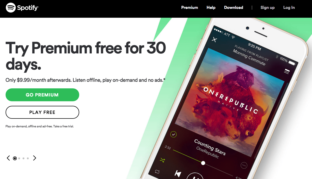
It’s clear which action you want the visitor to take, so make sure they know it. Check out Spotify’s homepage. They’ve made the ‘go premium’ button bold and eye-catching. They’ve made the ‘play free’ button fade into the background.
This is just simple psychology again. You subtly let your users know which one to click.
Hopefully, you should have a clear ‘user journey’ in mind. Let’s say you teach online courses through your website. A simple user journey might look like this:
Read latest blog > download free report and sign up to the mailing list > enroll in your paid online course.
If you have a clear journey, you can create a visual hierarchy to direct users where you want them. In this case, you’d make sure your blog was the first thing they see. Then, you’ll begin to include lots of links to your mailing list.
It’s often hard to resist the urge to get creative with layouts and elements. But the thing is, we all know what an online store is supposed to look like. We expect products to be laid out in simple categories. We expect product descriptions, reviews and a familiar purchase process.
Don’t try to reinvent the wheel with these crucial aspects! Keep it simple.
Again, this is all about resisting the urge to over-complicate things. Combining more than 3 primary colors is difficult and it will often confuse your users.
Color is also very useful in shaping your user’s experience as it’s closely connected to psychology and emotion. For example, we associate blue with trust (there’s a reason why Facebook uses blue!)
Match your color palette with your product.
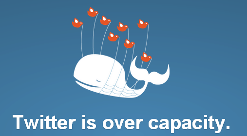
Sometimes, things go wrong and 404 errors are inevitable. However, you can actually turn this into a positive user experience.
Explain exactly why they’re getting this error by creating custom 404 and 504 pages. Twitter’s ‘fail whale’ was famous for this.
For unknown errors, reassure users that you’re working on it, and direct them back to your website.
Dead-ends, like error pages, are dangerous. Users naturally reach for the cross. Reassure them, and send them back.
Human beings are driven by a sense of achievement and completion. When they complete a task, let them know, and show them where to go next.
You can do this after they submit their email address, after they purchase a product, after they add something to their cart, or simply when they reach the end of a blog post.
It’s a simple, easy, positive experience. It also gives users a sense of collaboration; like you’re actually helping them to achieve their goals.
Consistency and branding is key to a good user experience.
It’s very confusing if your logo font is Futura, your body text is Times New Roman, your call to action is Comic Sans, and your headings are Windings…
Stick to just two font families. It’s easier to read and it looks more professional and trustworthy.
Sometimes, your users are going to get things wrong. Maybe they entered their password incorrectly and couldn’t log in. Perhaps they forgot to include a zip code on the signup sheet.
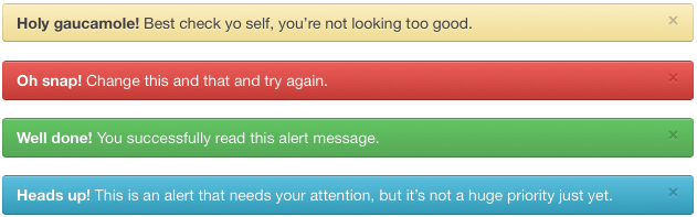
In these cases, you’re going to want a simple, but distinct error or alert message. Make sure it’s distinct in color and style to anything else on your site. It gives a clear indication that something needs action.
You should also make these alert messages consistent across your whole site. Don’t use a different color, style or placement as it just becomes confusing.
It’s just annoying.
Actually, there are more important reasons than that. We actually read uppercase text slower than lower-case. So it’s much more difficult to scan read (which is how we generally read the internet).
Reserve caps lock for when you really need to make an impact.
This is specifically for ecommerce websites, but it works across the board.
Try to keep similar and related items in the same place. It means your visitors and customers get a much more tailored service, almost like you’ve anticipated their needs.
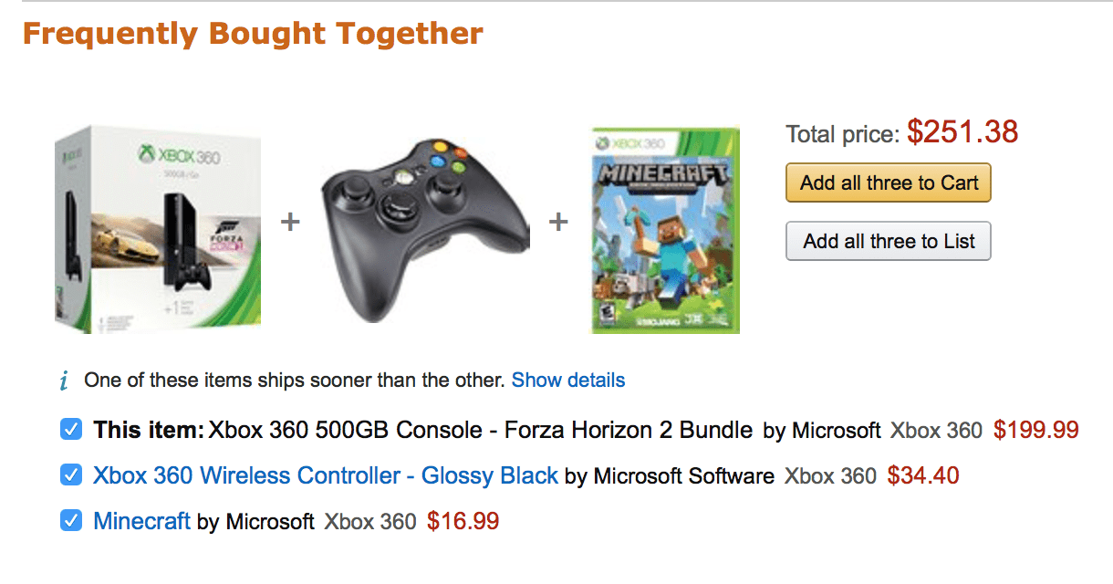
You can do this with physical products, like Amazon’s ‘more like this’ selection. You can also do a similar thing with blog posts and articles, using a related content section.
It keeps visitors browsing through your site, reduces your bounce rate, and creates a more personal experience.
The last thing you want is a visitor to click a link and feel like they’ve navigated to a different website.
Make sure your navigation bar stays in the same place, no matter where you are on the site. Ensure your logo is always visible and the color palette remains the same.
We don’t read websites like we read a book. Our eyes jump and scan for the important information.
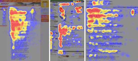
Typically we read websites in an F-pattern, but bold images and calls-to-action are also known to catch the eye first.
Most visitors to your website arrive with their guard up. They’re naturally cautious of new sites, and certainly aren’t ready to buy from you just yet.
As I said, a key part of UX design is removing these barriers, and making people feel comfortable on your website. A few well-placed testimonials and factoids will make people feel more at ease. We like to see that other people (ideally big names) have used your product and service, and approve of it.
Websites are typically made up of two parts: Number one: content – it’s static and we can’t interact with it. And number two: controls – these are things we can click and play and interact with.
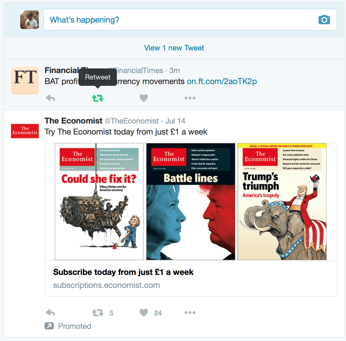
Twitter are great at this. Simple black text for content. Blue text indicates what you can click on and interact with. Icons fill with colour when you rollover to show what you can play with.
Invite people to play with your website!
No-one likes to get stuck on a confusing and difficult website.
Try to give your visitors a quick-win almost immediately. Ease them in and make it simple – especially if you’re offering a tricky business proposition.
User experience is all about mimicking a human relationship and making a connection with your user. Empathy is a huge part of this – What are your visitors’ goals and dreams? What’s been holding them back so far?
Immediately let them know that you understand their problem. You can do this with an image that they can relate to, or a sentence that sums up their biggest problems.
Your visitor will think ‘this website gets me!’ which is a great user experience to create.
Try to provide feedback to your user at every small part of the journey. It will create a real communication and relationship that users respond to.
You can do this with copy, such as “Good job!” “We thought you might like this”, “would you like to speak to an expert?”
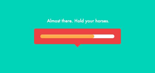
Or small graphics and visuals, like a thumbs up, a smiley face or a ticking clock on a loading page.
———
Combine these small tweaks and you’ll create a user experience that builds trust, connects with your target audience, and leaves them feeling happy and with a sense of achievement.
Are you using any of these UX design tricks? I’d love to hear about any I’ve missed to! Let me know in the comment section.
Daren Low is the founder of Bitcatcha.com. With over a decade’s experience in website development and internet marketing, Daren is a top authority on anything to do with building and managing an online business. Pick his brain today by connecting via Linkedin and Twitter.

