


Join our Telegram channel to learn more!
In order to build anything successful, you need a plan and a foundation.
If you’re building a home, you start with a blueprint to show the location of the rooms, their sizes, and the home’s final structure. The same goes for building a website.
While assets like images, video, and copy are vital to a website’s success, its layout can make or break it. It makes no sense to put brilliant copy and a gorgeous image on a cluttered and poorly-designed page, does it?
Today, we’ll look at 13 examples of the best website layouts, some best practices, and why mobile responsiveness is key.
13 Different Types of Website Layouts
Best Practices for a Great Layout
Mobile Responsiveness
Wrap Up
A website’s layout is the framework that determines the website’s structure and design. It dictates how text and images are presented on the page, and plays a role in the user’s experience (UX).
A layout can mean the difference between someone taking your call-to-action or clicking off of your website. After all, no one is going to fight to subscribe or give you money! Your website needs to make that process effortless.
So – here are 13 of the best website layouts that keep users engaged and coming back for more.
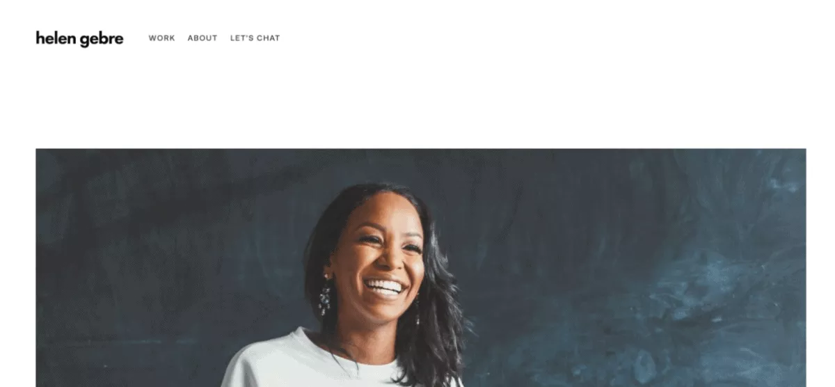
One of the most common and easy-to-implement website layouts is the featured image layout.
This layout allows you to incorporate a large image that acts as an anchor for your reader’s attention on your home page. The image is usually a powerful one that delivers the message of your brand/company.
This layout works especially well for people-centric websites like freelancers or solopreneurs.
Helen Gebre, a copywriter for hire, does this well with an excellent featured image on her website (image above). The image is warm and inviting and makes you want to find out more about her. In addition, there’s a generous amount of white space on her site, so it doesn’t feel crowded. The navigation bar is simple, and visible.
Featured image website layouts work great for just about any platform. What you want to make sure you do is select the best possible image to hook visitors and make them want to stick around.
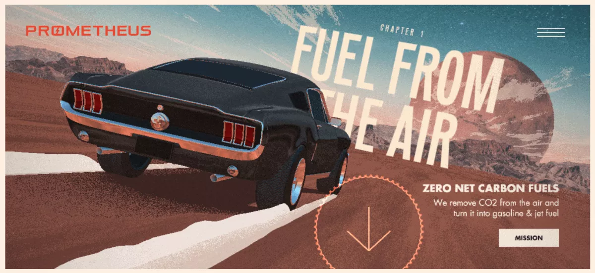
The Full-Screen photo layout uses an image/photo that takes up the entirety of the screen with text and menus on the top of it.
It works to deliver a powerful message that drives home your product/service to the viewer. The additional copy and use of call to action can elevate the image or bring it to life.
However, a downside of this layout is that some users can fail to realize that there’s more content on the page when they scroll down. So it’s important to incorporate a way for them to interact with the site and not click away.
You should also consider how these images look on mobile devices as well as desktops.
Prometheus Fuels (image above) is a great example of using a full-screen photo (or in their case a GIF) on your website. The photo ties in perfectly with the company and what they do, and the copy that accompanies the image fills in the blanks.
The tucked-away navigation bar in the top right-hand corner makes for easy access if you ever need it. There’s also an arrow showing that there’s more to see when I scroll down the webpage.
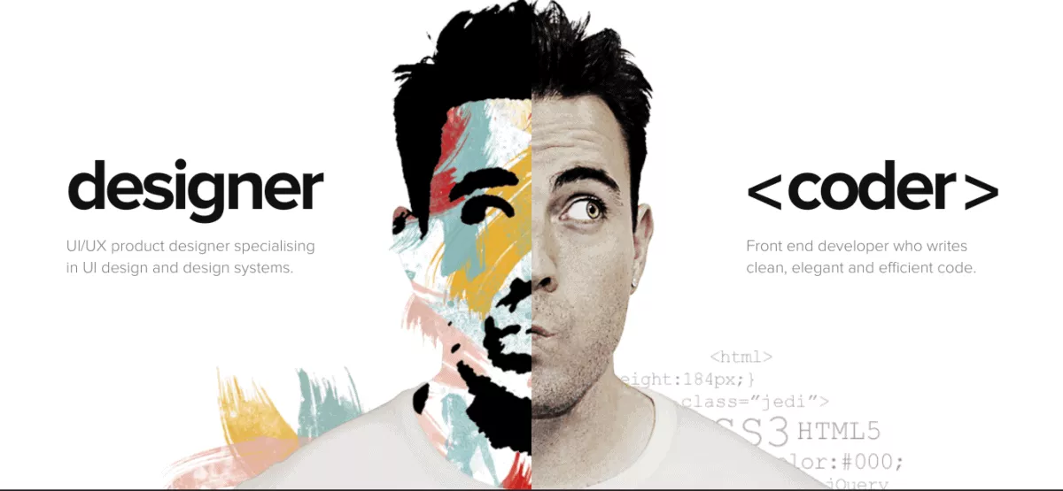
The split-screen layout works to show your reader the best of both worlds, or how 2 things can work together. This can refer to either a vertical/horizontal split on your webpage. It allows the reader to make quick choices and helps to secure engagement right off the bat.
Split-screen layouts work well for eCommerce stores with varying sections such as men or women, as well as portfolio websites, business websites, and more.
Adam Dannaway used the split-screen layout on his website well (image above). He’s a designer and a coder and uses the split-screen layout to display a preview of both skill sets at the same time, giving you, the user, the option to decide which to choose. It translates well on mobile devices too and invites you to engage while guiding you to what you need.
An important reminder, however, is that when you’re using the split-screen layout – don’t go cramming too much information on each side.
You only need to add the right amount to get them to choose.
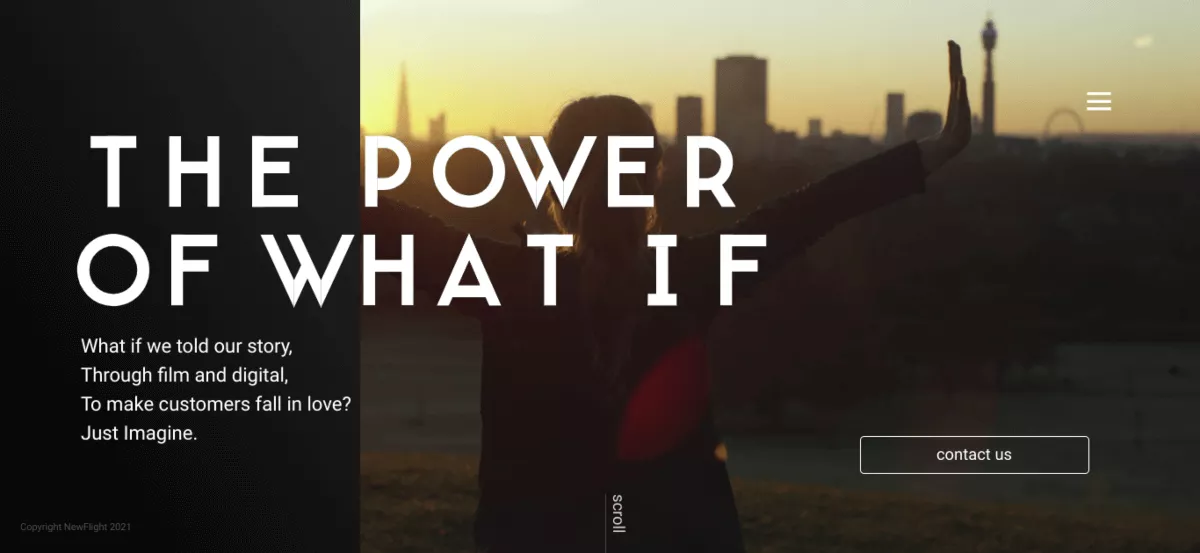
While the split-screen layout offers equal space between both sides of the screen, the asymmetrical layout uses imbalance to emphasize a particular area of the page.
The section with more screen real estate will attract greater attention, and you can use this to your advantage when presenting your information to your new, and returning users.
These website layouts are versatile and work well for a variety of types of website such as businesses, freelancers, and in some cases, eCommerce websites.
NewFlight (image above) is a film and digital agency based in London that uses the asymmetry layout throughout its website (vertical asymmetry on the Homepage and diagonal on the others) to capture your attention while leading you through the site, so you can get exactly what you need.
Asymmetry can be used on mobile devices, however, its impact is not the same as when it is used on computer screens. It’s important to adapt them for mobile users.
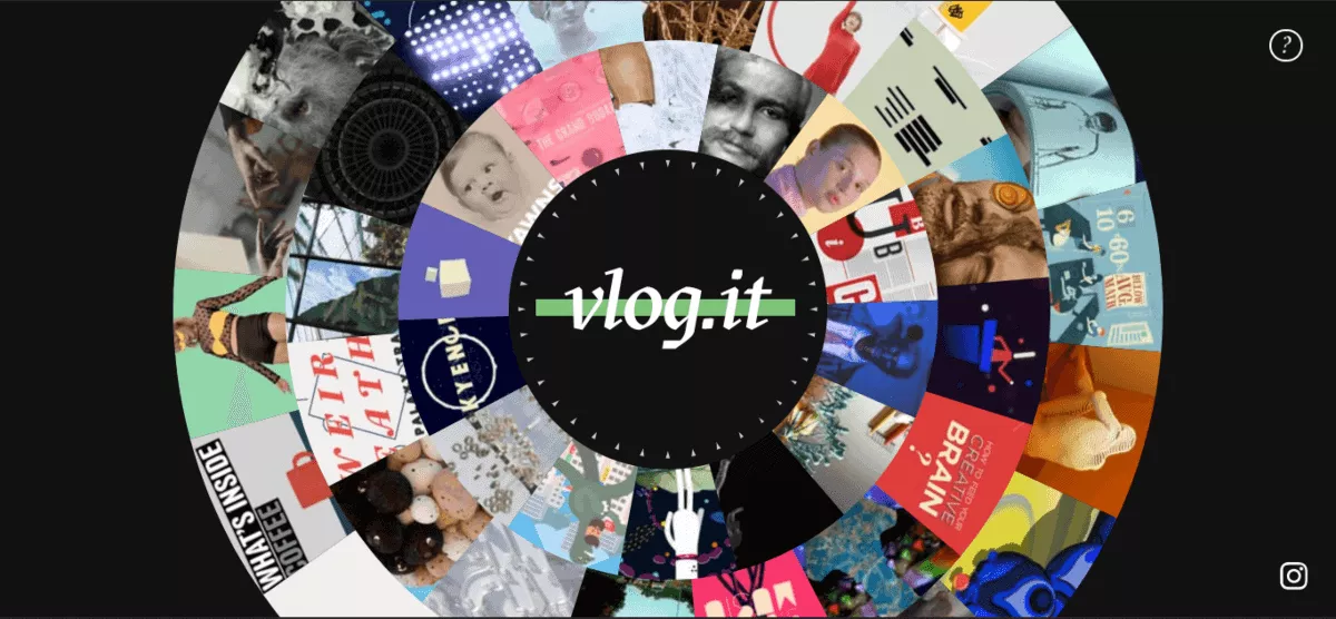
The radial symmetry layout is rather uncommon, however, when used correctly, it can have a dazzling effect.
It has a focal point in the center of the page with related items radiating from it in a circular formation.
The Vlog.it homepage uses the radial symmetry layout to display the different videos that the creator, Marco Rosella, has collected.
The layout does catch the eye, however, it is not widely applicable to many businesses and its adaptation to mobile platforms is limited as well. It seems to work best for websites that present information without any call to action.
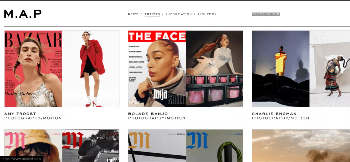
Easy browsing is one of the best things about a well-designed website and the grid layout offers this in spades. It allows you to display multiple interests on one page with an equal distribution of the text, pictures, and videos to show the various types of content.
You see the grid layout on video-sharing websites such as YouTube. It works well for mobile devices too and allows for the same browsing ease as it does on a desktop.
As a tip, make sure you choose the best images for each tile on your grid and make the most of the limited text space available, since this will serve as a preview to users.
M.A.P. (image above) utilizes the grid layout to display artists’ work. Each image gets the same room and necessary information listed to invite you to view more.
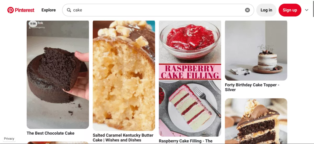
Card layouts are widely used across the web. The cards serve as mini containers of information such as text and images, and sometimes even have additional options such as a save for later feature.
They allow you to present users with just enough information to help them make their choice or click through to view more. One of the best things about the card layout is that it’s dynamic, and you can change the cards’ style, size, and order to suit your website.
This also makes the card layout great for mobile screens as they adapt accordingly. The card layout is often used on eCommerce sites as it’s a great way to present information on different items for purchase.
Pinterest (image above) is a great example of the use of the card layout. It orders the posts perfectly and the varying sizes fit the post type accordingly, whether it’s an image, a video, or an infographic.
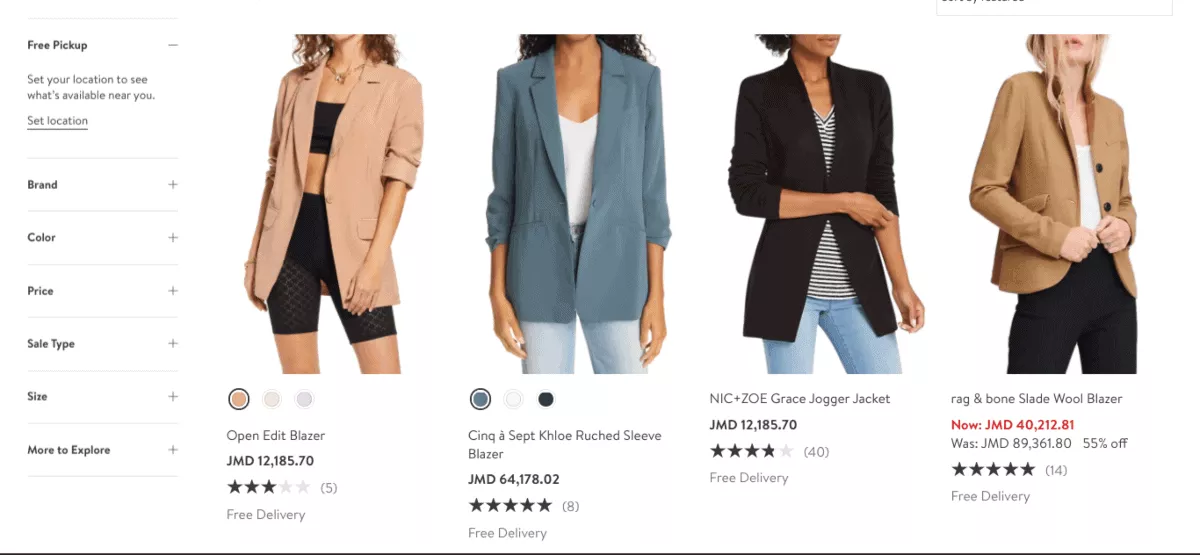
The F Layout is a website layout that follows another common scanning pattern of people’s eye movement.
We scan a lot of pages in an F pattern: where our eyes start in the top-right corner of the page, go to the next line, and do the same again – the cycle goes on until we find something that catches our attention.
To be fair, this pattern can also follow the shape of an E as well.
Nordstrom (image above), like many other eCommerce websites, uses the F layout to let users easily scan available items and pick and choose accordingly.
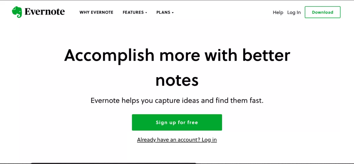
The zigzag layout is the one that fits the way how people (typically from Western cultures) naturally scan a webpage: in a Z formation!
Think about it, your eyes go from left to right, then down to the left then back to the right again.
This habit makes the zigzag layout work great for a variety of websites.
Evernote (image above) uses the Z shape layout on its homepage. When you look at it, there are two calls to action right there on the homepage that you can’t miss because of how you’d naturally scan the page.
The Z shape layout works best for computers because of the size of their screens, you’d need to have your website adapted for mobile to see results.
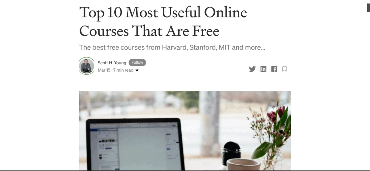
A common and simple layout to use, the single column arranges the website information in one column. It makes for easy browsing and navigation as everything is right there where you need to find it.
It works well for blog posts, long articles, research papers though may be less effective for eCommerce sites than the card or F layouts.
This layout’s design also makes it great for smaller screens such as the ones on your phone or tablet. Medium(image above) uses the single-column layout for its articles, making them easy to read on any device.
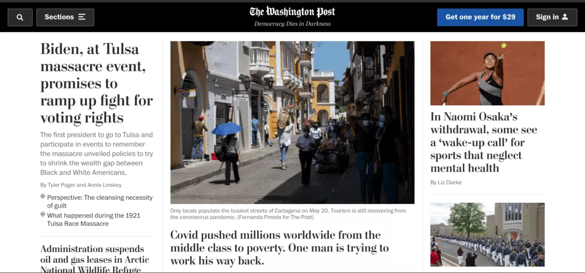
The Washington Post uses the magazine layout for its website.
The magazine layout is often a fusion of other layouts designed to deliver a unique experience to readers. It’s inspired by the traditional print layout and allows for headlines, images, and sometimes a bit of the body text for each post.
While this layout works well for magazines/news websites, it can be difficult to adapt for mobile screens.
A solution for this is making some stories larger than others and allowing for ease of navigation. Mobile navigation cannot be ignored, especially for websites that use magazine layouts, given that roughly 57% of adults get their news through mobile devices.
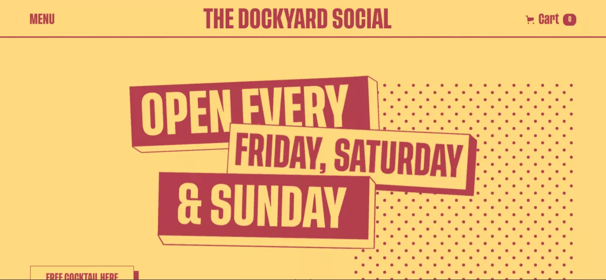
Another uncommon layout is a single-page layout. This one’s pretty unique because it incorporates multiple actions into one page and the content is dynamically loaded using JavaScript. A single-page layout most people are familiar with is Gmail.
Single page layouts work well for both desktops and mobile devices.
This layout is best for simple portfolios and event sites, such as The Dockyard Social (image above),the website for a “street food warehouse.” Everything is loaded at once, which allows for easy navigation and use. It’s also quite responsive on mobile devices too, which is great because many people would use their phones to research an event/place to eat.
However, while the single page layout is great for say a portfolio or an event, its simplicity in design can make this layout unsuitable for a news or eCommerce site.
As we’ve mentioned, a website’s layout plays a critical role in not only presenting information, but also how the user navigates the website.
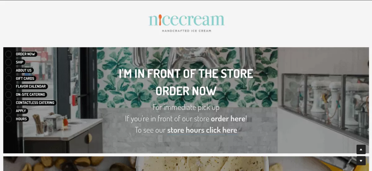
The fixed sidebar layout has (surprise surprise) a fixed sidebar on either the left or the right of the page. This keeps the sidebar in view and accessible as users scroll down the page.
Nice Cream (image above), a website for handcrafted ice cream (sounds delicious by the way), uses the fixed sidebar well. The sidebar is simple and cute, it fits the website’s aesthetic perfectly with each category being in a rounded rectangle.
When you’re using a fixed sidebar layout, ensure that it adjusts for users on mobile devices and for those who use minimized windows, so as not to take up too much screen real estate.
Now that you’ve decided on your website’s layout, here are the two best practices to use when designing your website.
When you’re designing your website, it’s critical to put all the important information above the fold, i.e. it is displayed before your users scroll down. This means that visitors have everything they need as they land on your page. Things to remember are:
Having all of these above the fold can help convert more users more quickly.
A navigation bar acts as your website’s map and allows users to easily find what they need and take the action that you need them to take.
As we’ve said, no one is going to fight to give you money. If navigating your website is confusing, they’re going to leave and go to a website that doesn’t give them a headache.
As such, you want a navigation bar that’s simple with enough categories for easy traversal.
Also, don’t clutter the bar with every single category! Employ subcategories and a search bar to help visitors better navigate your website.
As smartphones have become more essential to our everyday lives, many people do their browsing, watching, and shopping on their phones.
Since you can’t control the device that your visitors will check your website on, you need your website to provide the best possible experience, no matter the device.
‘Responsiveness’ is when the layout and content of a website change based on the size of the screen the visitor is using. A responsive website will automatically adapt to the device you’re visiting it on.
When you’re designing your website, consider how it will look on the 4 main screen types:
The easiest way to do so is to use a good website builder that takes this into account. Our top choice is always Zyro, since all their web templates are fully responsive.
Mobile responsiveness is especially important given the statistics regarding mobile browsing and eCommerce.
According to Oberlo, 48.67% of total web visits in the US are from mobile devices, – that’s nearly half! As for eCommerce, mobile eCommerce sales sit at a current market share of 72.9%.
That’s too much to miss out on for any business!
A website is like the digital home of your business.
The same way you’d want your brick and mortar store to be gorgeous, functional, and hospitable – so your website should be too.
Your website’s layout is critical to your visitor’s experience, and we hope this list helped you find the best layout for YOUR site.
If you’re a freelancer and need something simple yet effective then a Feature Image Layout or a Single Page Layout may be up your alley. If you’re looking to sell your creations online, then maybe the Grid or Card Layouts are the ones you’re looking for.
Once you know the layout you want to use on your website, check out our full guide on how to make a website.
Orane Ennis is a writer with a passion for tech and how it will change the landscape of business. He’s most excited to see how augmented reality will blend the real and digital world in the years to come.

