


Join our Telegram channel to learn more!
Need a website color scheme? Go ahead – pick a bunch of colors.
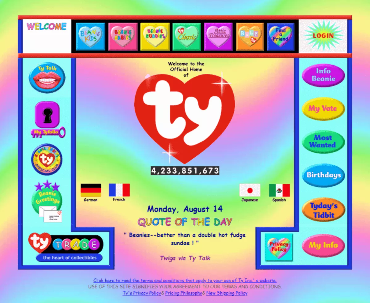
Alright, jokes aside, there’s definitely a scientific way to understand what’s visually appealing for your audience. That’s why you probably gagged at the image above – because you have some sense of what a good-looking website should look like.
There are also reasons why it’s easy to imagine what brands someone else might be thinking of when they say “Golden Arches” and “Coffee Lady in Green”.

And that’s why I’m guessing you’re here – to figure out what makes a website color scheme good, how to choose one, and why they matter when you’re making a website.
Ultimately, it’s good branding; when brands become “sticky” in our headspace. Colors do more than just making your site look pretty – they can help determine your site’s success.
Here’s what we’ll cover today:
Why Website Color Scheme Matters
4 Steps to Pick Your Website Color Scheme
Examples of Well-thought-out Website Color Schemes
Wrap Up
Let’s explore how form follows function, shall we?
Whenever we think of colors, what do you think happens?
We naturally associate them. For example if I said “blue” – you might think “sky” or “sea”.

If someone says that they’re seeing red, you may automatically think of “red eyes” or “anger” even.
Understanding that building a beautiful website is not just about choosing and splashing on colors that you like, but a way to invoke certain emotions and actions in your audience. It’s what will allow you to leave your competition behind, green with envy.
In a nutshell, a cohesive and coherent website color scheme will do the following:
If you’ve read up to this point, I’m glad that you enjoyed my witty copywriting but more importantly – I hope you appreciated my humour in choosing one of the most unironically ugly websites back in the year 2000 as an opener.
A picture paints a thousand words after all.
Everyone’s familiar with Amazon’s logo which means selling everything from A to Z, and putting a smile on everyone’s faces when they do.
![]()
More important to note here are the colors chosen. Orange (especially bright orange) conveys a bit of playfulness, fun and warmth. And black is usually more associated with timelessness, authority and prestige.
Putting them together not only creates a strong contrast aesthetically, but in terms of meaning. It’s kind of saying “We’re a force to be reckoned with, but we’re still approachable.” Read more on the black and orange color combo here.
The longer a brand consistently uses the same color scheme – the more memorable it becomes.
Think about a popular soft drink that’s red. You would know that I’m referring to Coca Cola, but at some point in time before the 1950s — Pepsi was actually a predominantly red logo before it integrated the blue we know today.
Choosing the right website color scheme will help your visitors remember you.
Any website owner should know that call-to-actions, like buttons, are one of the most important things to pay attention to. Especially on a landing page.
A/B testing and case studies have shown that there’s no one color to rule them all in terms of getting clicks, but intent and color need to match.
For example, if your call-to-action is to “Buy Now” – typically you’d want to use red or orange as opposed to green. Conversely, if the call-to-action is “Learn More”, it is arguably better to use green instead of red.
Who doesn’t want more conversions?
Now that you know the importance of a good website color scheme, here’s how to select one that fits your brand best.
Here are the 4 most important steps:
Learning about these is half the battle won, because color theory is a science in its own right.
Some people find it helpful to understand a bit of basic color theory first. Color theory is essentially making sense of which color works well with which color, and which doesn’t.
It’s slightly technical but good to know the difference between warm and cool colors, hues versus shades/tints/tones as well as complementary, analogous and triadic schemes.
If you’d rather not stress too much into color theory – here are a few useful tools we’d recommend that can help you find color pairings:
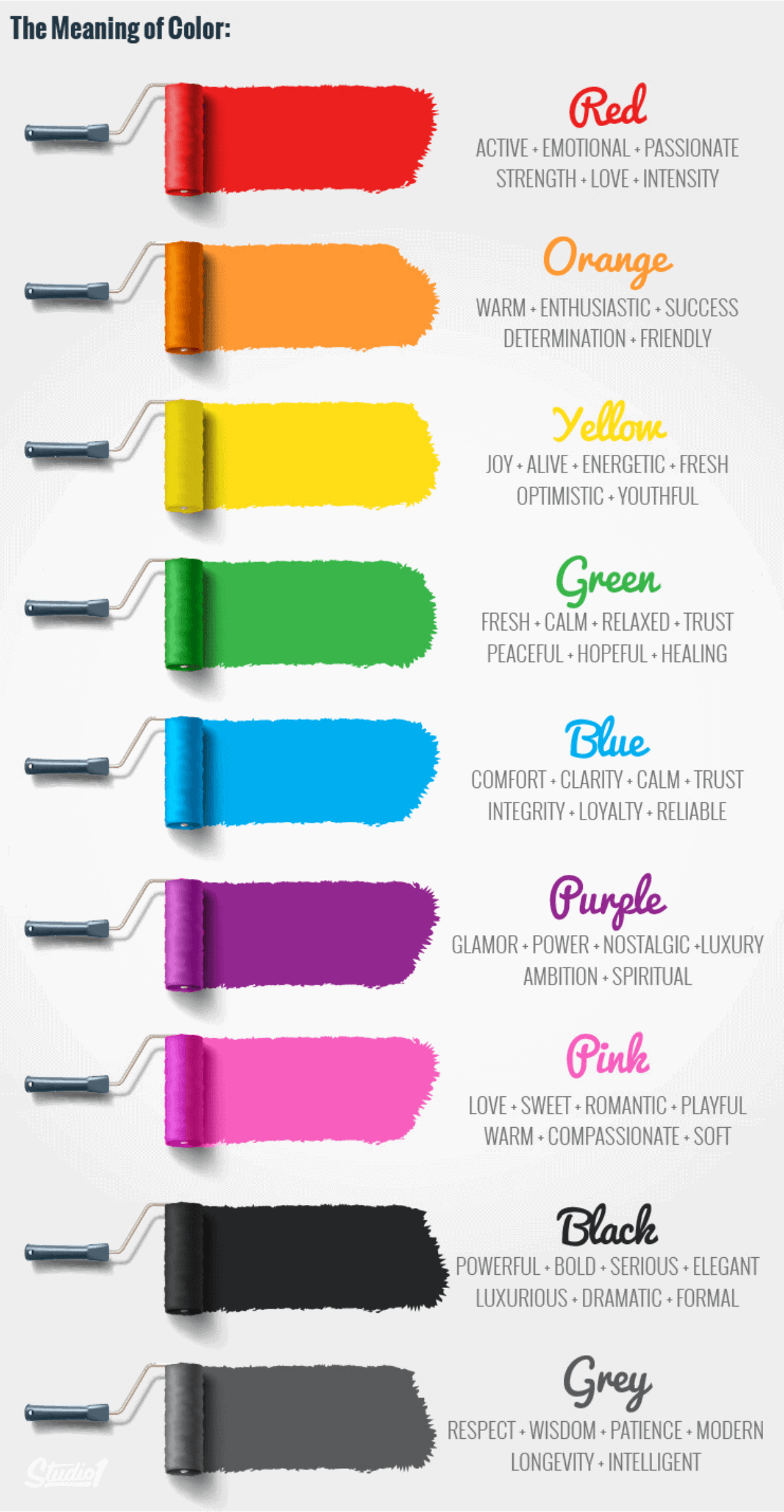
Just as important though, is to know how color can affect emotions. This has been graciously summarised in the infographic below:
Quite often, the most boring part about creating any brand, business or website is establishing its vision and mission statement.
Thankfully, we have this branding exercise, which is to think about your brand as a person. In other words, if your brand was a person – who would it be, how would they talk and behave? These are known as ‘brand archetypes’.
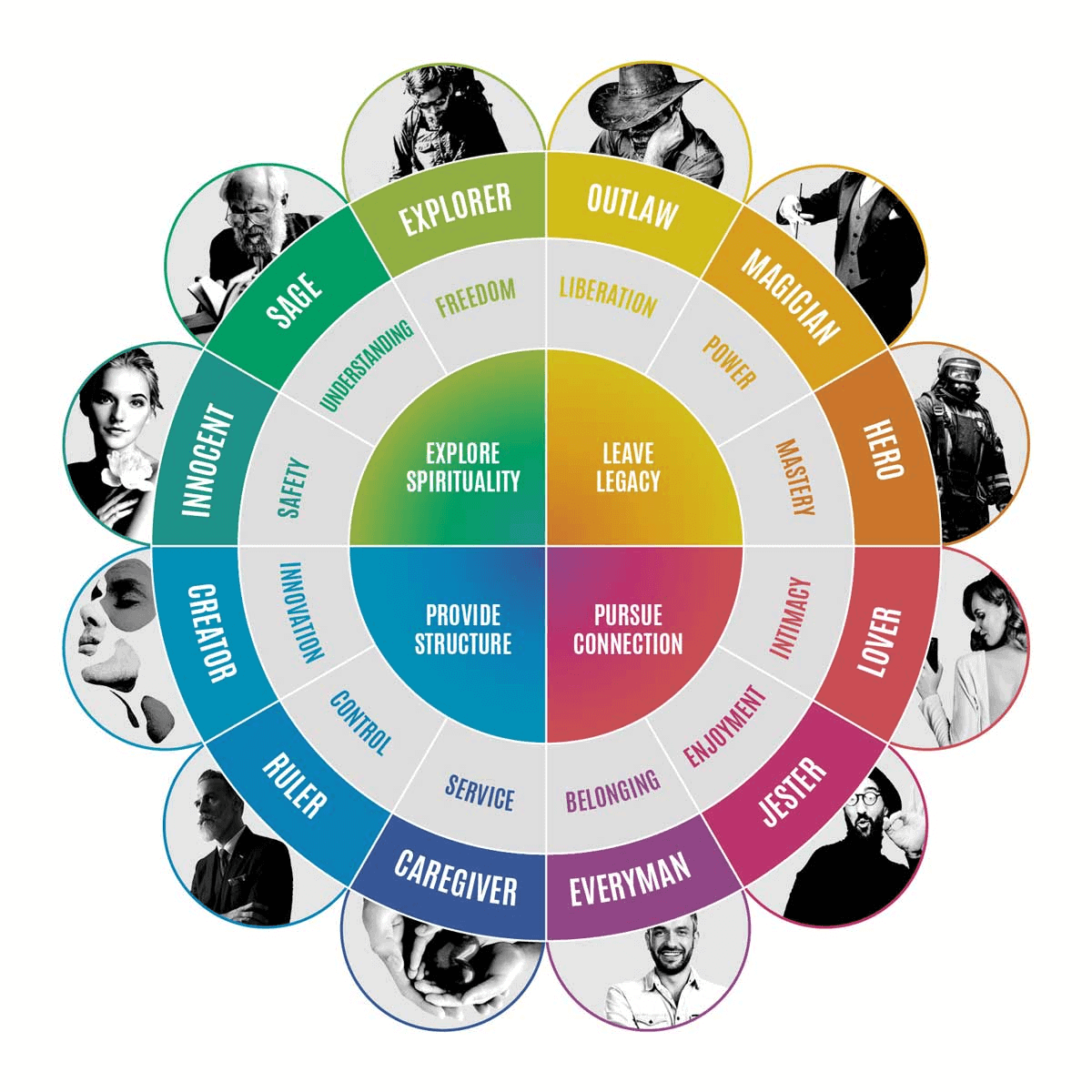
Once you’ve determined how your brand should feel and sound, you can dive further into each brand archetype color and usage.
Alternatively, you can also look at what colors your competitors are using and even try to figure out how they’re positioning their brand.
By the end of this exercise, you should have shortlisted, at most, 3 colors for your website.
Next up, what do you want your visitors to feel when browsing through your website?
What are their pain points through each touch point of the user journey? These can also be addressed with color associations.
As a start, if you were selling makeup and skin care products, does it make more sense to have pink or green accents? Sometimes, both can work as per the example below.

In this case, purple, green and pink are used in a very subdued manner – white tints are added to give the visual asset a more pastel and soft touch.
Pro Tips
Once you’ve determined your ideal audience and the emotions you want them to feel with your brand, shortlist another 3 associated colors.
By now, you should have a minimum of 3 colors and a maximum of 6.
This is good because this would be the final shortlist in which you’re looking for a dominant, secondary and accent color.
This is also known as the 60-30-10 rule, which represents roughly how prominently and proportionately these colors show up on your website.
“But wait, I have 6 colors and I really like them too – can I keep them or do I have to trash them?”
Congratulations, you have reached the final stage of branding. If you truly believe in the other 3 colors that you want to keep, they could still potentially be incorporated in a design guide as shown below:
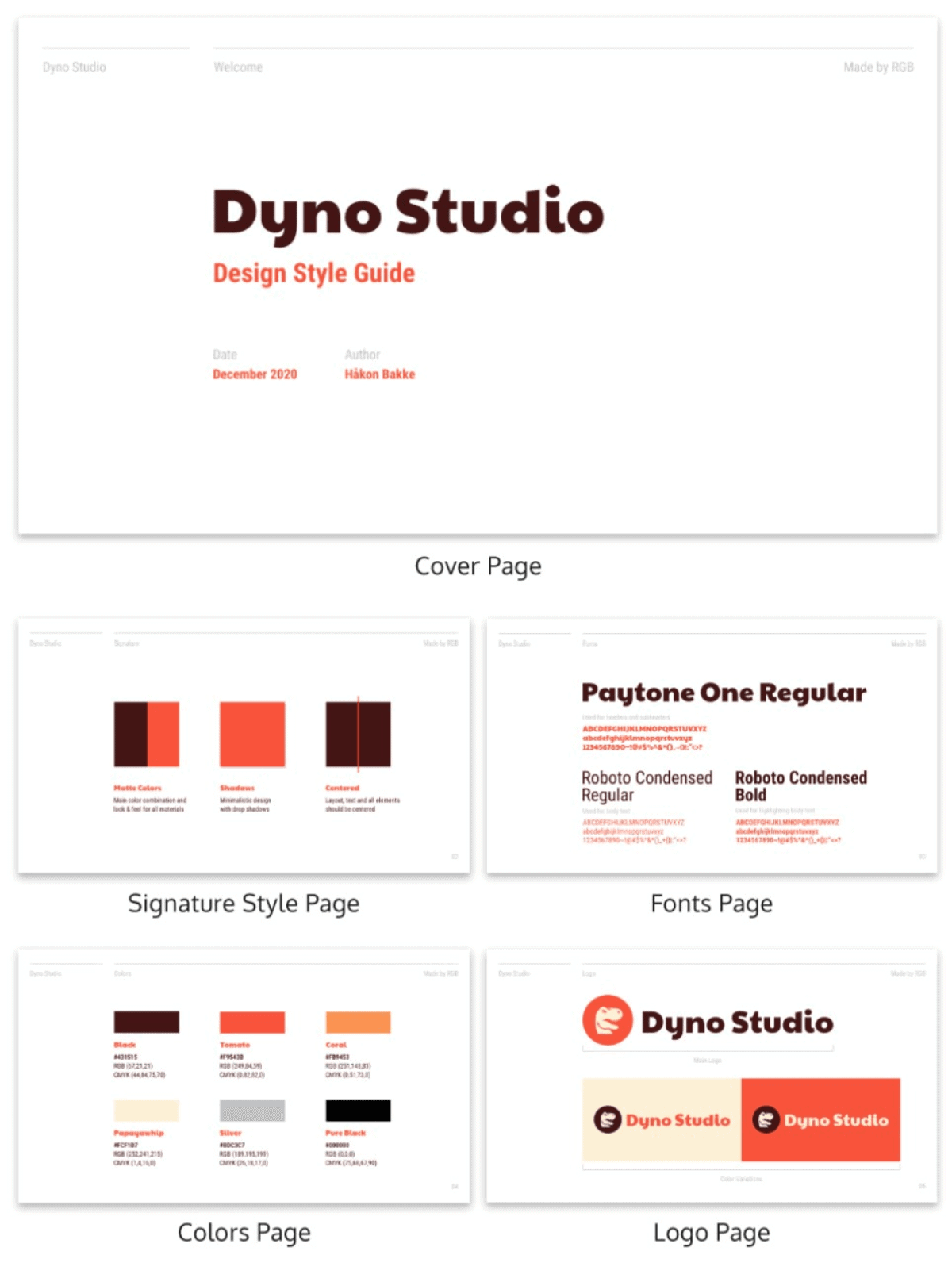
Typically, more elaborate design style guides could also include what kind of fonts to use, how to use your logo as well as button styles and colors. This exemplifies and serves as a documented brief for whoever works on the website’s graphic design and visual assets.
At the end of the day, picking a color palette for your site is for yourself to feel good, and for your users to feel even better.
Here are a few examples of color schemes from real websites to sum our learnings up:
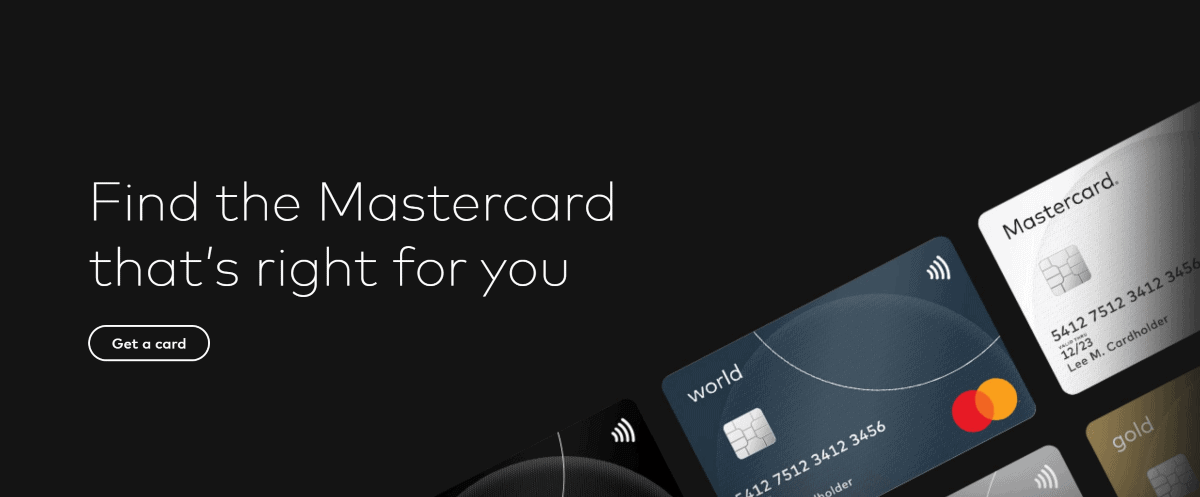
While the Mastercard logo stands for strength, success and optimism – the website uses a very dark shade of grey to convey respect and professionalism being a leading credit card provider, after all.
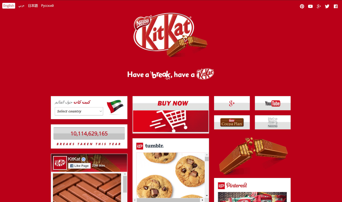
Is the color yellow or red more attention-grabbing?
While the Kit Kat’s red site might be trying to convey intensity and passion for chocolate wafers, it can be confusing to know where to put your attention. The “Buy Now” button? The logo? Its YouTube channel?
Rather than choosing a color to simply grab attention, a cleverer use of color would be to draw focus to the user’s eyes as quickly as possible on the most important call-to-action for that page.
Compare that to Yellow Page’s website.
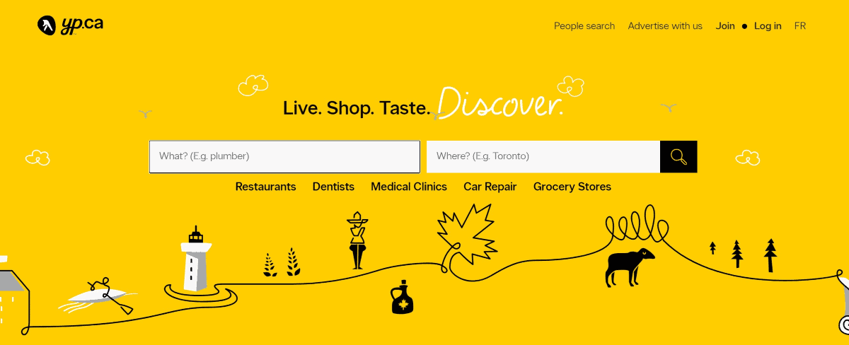
With the dominant yellow color on Yellow Pages, black is typically an excellent contrasting color that serves it well as a button here. And very easily, the white space becomes the centre of attention, guiding your eyes toward filling the fields in first.
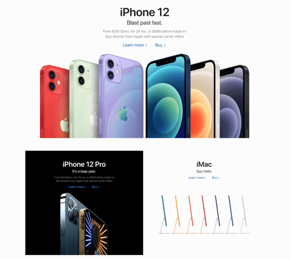
Speaking of white, don’t forget that you have black, brown and grey also. Apple does this pretty well, creating stark contrast between its colorful products while still maintaining its elegant and simplistic branding by using black and white.
Keeping in mind that Apple is all about “clean and simple” encompassed by their white, with a positioning of luxury and elegance with their black backgrounds.

This was more of a fun fact for you to chew on actually, based on this experiment in 2016.
Given that blue is supposed to be synonymous with trust, comfort and reliability – is it truly a surprise that this is the most popular color on the internet, possibly the world?
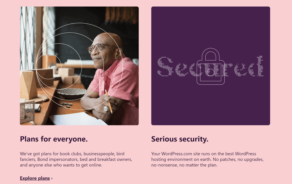
However, whilst WordPress does use blue as their leading branding color, they aren’t afraid to mix it up.
Scrolling down WordPress’s site will reveal a calming green, probably to convey the ease of building websites with them.
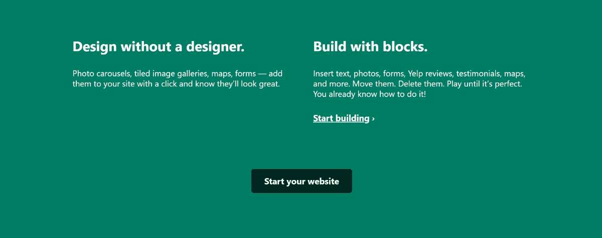
Scroll further down and you’ll see pink, which typically signifies love and compassion that could be tied in with “Plans for everyone”. However, there may be some disconnect altogether using pink for “Serious security”. Perhaps, they were going with an overall theme of “care” in this section.
As above, these are general guidelines so it shouldn’t be followed rigidly to a T.
Regardless of industry, most brands tend to stick with the same color palette for years. It’s quite rare that brands make 360 changes to their brand or dominant color – for example, from neon green to navy blue.
At most, we may alter hues, shades, tints or tones over the years but the primary colors you choose today won’t stray too far off as long as the brand persona stays the same also.
As a website owner, the most important thing is to experiment and have fun – it is an iterative process after all and if possible, you can even do some serious A/B testing on colors at the product page level.
Next – read our article on the best places to find unique & free images for your site!
Chuck Lau is the Operations dude for an Australian e-Commerce store by day, and a content writer by night. He currently owns 3 cats and hopes to create a cat sanctuary one day with his life partner.

