


Join our Telegram channel to learn more!
Everyone and their cat has an opinion on User Experience (UX) design, but it’s actually dead simple. And, um – incredibly important.
UX design is all about creating a compelling experience for your users. It’s knowing what they want and delivering it quickly. In the context of a website, the best UX design makes the user think your website is created just for them.
Today, I’ll take you through a 4-step approach to UX design, so you can apply its principles to your own site. Whether you’re looking to make a new website, or optimize an existing one – this one’s for you!
Website UX Design Handbook
Wrap Up
Ok – you know what I kind of wanted to call this article?
“How to connect to your user’s hearts and minds, improve conversions, skyrocket sales, and keep customers coming back.”
I didn’t (our designer would kill me), but this string of promises is exactly what great UX design can deliver. And it’s something EVERY website owner needs to get right.
If a user has a great time on your site, it’s a great time for you.
It’s why you should make sure your website is fast and easy to navigate. And it’s why you need to nail UX design.
Here are the 4 stages we’ll cover in this handbook:
So, let’s jump into part #1 – figuring out what value you bring to readers.
The first thing I want to focus on is Value Proposition. I know, I know – another fancy buzzword. Or is it?
A value proposition is actually THE foundation of good UX design. It’s what opens the door and gets users to sit up and listen.
When a visitor lands on your website, you’ve got about 5 seconds to convince them why you are worth their time. They want quick answers.
That’s a lot of information to convey in just 5 seconds!
The trick is crafting the perfect ‘Value Proposition’. This is a short, sharp description of your business and why it’s useful. It should be the first thing your users see when they visit your site, and it tells them exactly what you can do for them.
If you get it right, you’ve just created your first great user experience and they want to know more about you. If you get it wrong, they’ve already left.
So first, let’s nail your value proposition. It takes 7 simple steps:
The value proposition starts with a laser sharp description of your service.
If you’ve never tried to condense your business proposition into one sentence, try it now. It’s tricky, but it’s crucial that you get it right. Here are some great examples:
The best products and services can be summed up in one digestible sentence. Can yours?
Is your service built for developers, graphic designers, cat lovers? Tell them. Connect with them. Say “this service is for you!”
Photoshop is excellent at this: “The world’s best imaging and design app with new tools for designers and photographers.”
It’s simple and it gives them a clear, defined target audience. Who is YOUR product for?
It’s not enough to tell users who you are and what you do. That alone won’t convince them to buy your product. You need to show them a better world.
Tell them how you will add value to their life. What problem will you fix? This is your promise to the user.
Apple are the masters here. Take the iPad, for example. Back when it first launched, they ran the copy: “The iPad changes the way you do things every day. Take on a new project, pick up a new skill or start a new hobby.”
Years later, the newest iPad continues this legacy.
Rather than focusing only on product features, Apple sells you on the lifestyle and the possibilities they unlock.
Try doing the same thing for your product or service. Sell the dream.
If step #3 is all about selling the dream, step #4 convinces the practical part of your brain. It’s the tasty little extra that convinces them to keep going. It’s the tangible, quantifiable benefit they’ll get from using your service.
Think of Facebook’s clincher: “It’s free, and always will be!” It could also be a discount for new users or a money-back guarantee.
The internet is bursting with new products. Tell the user how you are different. What makes you the best?
WordPress fill their value proposition full of unique offerings: “The easiest way to create a free website”, “We power more than 41% of the web”.
Give them a clear reason to trust you over the competition. Are you the easiest service, the best, the cheapest, the most popular, the most eco-friendly?
It’s a cliche, but a picture really does paint a thousand words. Choose a graphic or hero shot to accompany the copy. It ought to show your product or service in action. Make it look irresistible and vital.
If you’ve perfected the first steps, you’ve done the hard work and convinced them. All you need to do now is point them in the right direction. Give them a direct task: “Sign up now” or “click to find out more”. Easy.
Without knowing your value proposition, you can’t reach out to the right people. More importantly, you can’t provide a simple user experience, since you’ll leave visitors confused.
In short, good UX design all starts by telling people what you do and why they need you. But it doesn’t end there.
If you want to truly connect – you’ll want to understand the heart of WHO these users are.
Which leads us to part #2.
I mean, you can’t expect to ace user experience without thinking about users.
As I’ve said – good UX design is about making the user feel like your website has been designed just for them. They feel at home, connect with the content, and – most importantly – can find the answers they’re looking for.
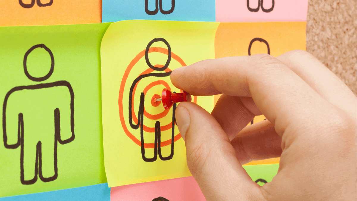
There’s an old saying you should live by: “If you try to please everyone, you won’t please anyone”. Defining and targeting a specific audience is the only way to craft the perfect user experience.
When you target a group of people with common characteristics, ambitions, and problems, you can create a bespoke user experience, just for them.
The essence of entrepreneurship is finding a problem and solving it. What big problem does your product or service fix?
Once you know this, you can target those that suffer from it. Even if they don’t know it yet!
Spotify, for example, quickly became the world’s biggest music streaming service. How did they do it? They solved a big problem. They gave us instant access to free music.
But that wasn’t the only reason for their success (lots of other services do this). Their success was down to the way they targeted their first users. It went after those that were frustrated with the current system.
They defined their audience as: young, early-adopting music-lovers who consume and share their media online. Then they aggressively went after them by sending exclusive invitations.
Good UX design is all about solving problems quickly. Spotify found a problem, fixed it, and shared it with all the people who wanted it fixing. What problem are you fixing, and who else wants it?
When defining your audience, you want to avoid generalisations. You need a clear, sharp image in your head. Not just a table of data or a graph. You need a real human being.

In a second, you’ll be creating an imaginary user profile.
This fictional person is the ‘ideal’ customer for your product. You’ll want to define their characteristics in as much detail as possible because you’ll be using this user profile to help make every future UX design decision.
Would your ideal customer like the new colour choice? What would they think about your choice of language? Your user profile becomes your benchmark for service.
To get your user profile right, you want to think about 2 key areas:
Make a list of the age, gender, location, occupation and income of your ideal customer. This will help you begin to tailor your website and UX design. Their age and gender can help determine what language to use and what tone to take.
Remember how Snapchat aggressively targeted the 13-34 year old market?
They used bright colours, which are psychologically linked to young adult preferences. They use emoticons and copy aimed at a young audience (lots of exclamation marks, smiley faces, and superlatives). They tailored their UX design to their demographic.
Demographics aren’t enough. The most powerful results come when you design the site not for who they are, but who they want to be.
Target people with a dream, and they’re more likely to take notice.
Design it for the aspiring entrepreneur. Or the person who wants to run a marathon, or wants to start a blog. Sell them a dream, and show them how your service helps them get there. Good UX design is about showing them a better way forward.
So, with that in mind, define your target audience by their motivations. Why are they coming to your site? Where do they want to be in five years? What are they passionate about? You’ll provide a great user experience if you inspire them.
The Perfect User Profile Example
This user profile incorporates more than just demographics:
Abby is an aspiring entrepreneur, aged 31, living in London. She runs a blog about web design and considers herself a thought-leader. She follows developer blogs and shares content on Twitter and LinkedIn. She’s desperate to increase her social media reach.
Knowing their demographic lets you craft a space that feels like home. Knowing their dreams, lets you empower her to grow her business, show her how to increase her social media reach, and ask her to share it all on Twitter.
Combined – that’s a powerful user experience. And it’s all because you defined your ideal user.
Now, your turn. Take a long, hard look at your product or service. What target audience is going to devour your product and share it with others? Create your own ideal user profile and craft your UX design specifically for them.
The more you know about your users, the better the service you can provide. It answers questions, delivers value, and makes the user feel at home.
In Part #3 of our guide – we’ll be evaluating how well your current UX design is working.

You’re here because you want to create the best possible user experience. But, you can’t improve until you know what’s broken. So let’s examine your current UX on your website.
Here are 7 ways you can go about this.
First is to gather real data on who your users are. Who are they?
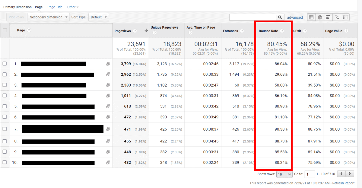
Google Analytics is a great tool that records information about every person that visits your website. It gives you a demographic breakdown of age, gender and location. You can also track users’ interests (based on their internet behaviour). Use this information to determine who’s using your service.
Bonus Tips
In part #2, we talked about creating an ideal user. Check if your analytics match the ideal user you created. If so, then congratulations, you’re reaching the right people! That’s the first step to a positive user experience.
Using Google Analytics, you can also track the search queries that lead people to your website. This tells you what questions people are asking. It tells you exactly what they’re looking for. Are you providing it?
For example, here at Bitcatcha, we help small businesses find the best web hosting services. When I dive into our Analytics account, I love to see search queries like “what is the best web host?” because I know that Bitcatcha has the answers! That person is getting a great user experience.
What questions are your users asking? And are you answering them?
If you’re reaching the right audience and answering the right questions, you can assume you’re providing a good user experience. Now you need cold, hard proof.
Quite simply, you can tell if your UX design is working by looking at your conversion numbers. Are they signing up to your service? Are they buying your product?
It’s time to jump back into Google Analytics to find the answers.
The best way to do this is using private questionnaires. The anonymity means your users will be much more forthcoming and honest about their thoughts (compared to a focus group, for example).
You can quickly create a questionnaire using SurveyMonkey. They’ll help you build a survey and integrate it onto your website as a pop-up. Ask them clear, concise questions and encourage honesty. Here are some good questions to ask:
What does [my website] do?
This is a chance to see how well your value proposition translates to people. Do your users actually understand what you do?
What is the most frustrating feature of [my website]?
People aren’t naturally inclined to talk negatively about you. You have to ask them outright. Open yourself up to criticism and learn how to improve the user experience.
What could [my website] do better and what features would you like to see?
Your users are often the best ones to tell you how to adapt. After all, they’re the ones using your service. Let them tell you where to go next.
Eye-tracking is a lab test that shows you exactly where users look and click on your website.
One affordable eye-tracking tool is a piece of software called Clicktale. It shows a sample visitor’s every movement with heat maps and playbacks. You can actively see where users struggle to navigate and watch how they interact with your site in real time.
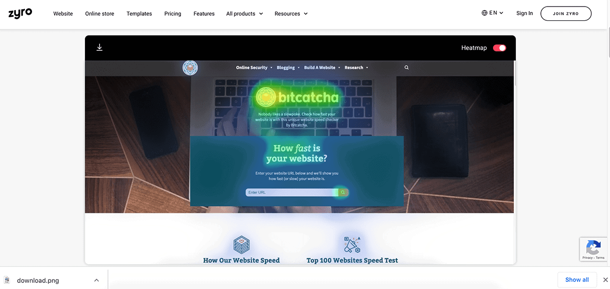
There are free options too. The website builder Zyro has a free online AI tool anyone can use – simply upload screenshots of your website here and it will highlight the areas where reader’s eyes are likely to linger.
If you’re trying to decide between two navigation layouts or different wording, try both! Create two separate landing pages and split your traffic equally between them.
Now, use Google Analytics to measure the performance of each. Which one encourages more sales, signups, and conversions? It’s a clear indicator of your best UX design.
You should relish the opportunity to get free, easy feedback from your users. Customer service queries are a key insight into the experience of your visitors. I like to think that a user that cares enough to write to us (even negatively) is a user worth having. What are the most common questions and concerns?
Use this chance to connect with your users and ask them what you could do better!
Your UX design is never ‘done’. Keep learning more about your users and keep testing their experience. Open yourself up to criticism, learn more about your visitors and never stop adapting. Trust us, the user is always right.
In the final section of this guide – we’ll be looking at how to make users do what you want.
The fourth, and final, part of the series explains how to use psychology to connect with your users. More importantly, I’ll show you how to make them do exactly what you want.
Using psychology in UX design is seriously cool. In a Jedi mind-trick kind-of-way, not a Sigmund Freud kind-of-way.
Using clever tricks and techniques, you can influence your users to feel, think, and do anything you want them to.
Psychology is the reason you buy something on Amazon before you realise you want it. It’s why you’re watching another episode of Better Call Saul on Netflix at 4am. It’s why you can’t help but click on an UpWorthy link.
Their UX design makes us. These companies understand basic human urges. And they make them a core part of their website.
Here’s the scary bit: I’ve already used one of the biggest tricks on you.
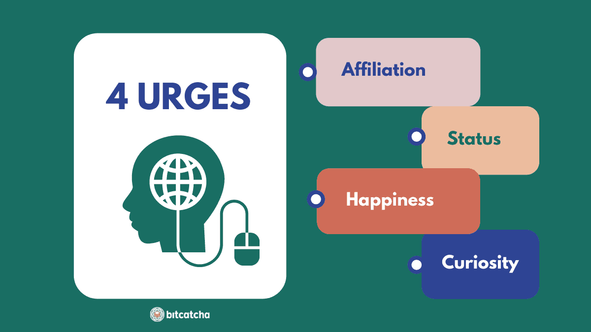
The first trick is tapping into your users’ basic human urges.
There are 4 main primal urges that drive all behaviour online:
Now you know the basic human urges, how do you use them to your advantage?
Humans are naturally curious, but they are also cautious when exploring new things. It’s your job to connect with them and make them trust you.
The quickest way to earn trust is by empathising with people. Show them you understand them. Remember, users are looking for affiliation.
You do this by designing your UX in the image of your target audience. Now that you’ve defined your audience (in part #2 of this guide), you should have a good sense of their demographics, interests, and goals. Create your website in a way that resonates with your users.
eCommerce giant, Etsy, for example, target the crafts market. Visit their site and you’re greeted with images of their users drawing, stitching, and creating new products.
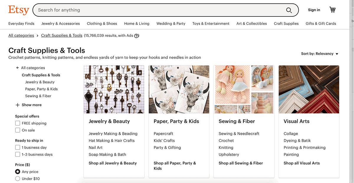
They highlight the comradery between sellers and customers. It provides a welcoming atmosphere for their target audience. If you love crafts, you instantly feel at home here.
It’s scarily powerful. Yet, it’s nothing more than simple psychology and the natural instinct to find a community.
As a small business, you can follow their lead. Use language, content, and images that connect with your target audience. If you’re an eCommerce company, make sure your target audience is modeling the product in your imagery. Show your users that you understand their world, and invite them in. It’s the first step to trust and respect.
Unfortunately, that isn’t quite enough to convince them.
Trust isn’t just about likeability and association. It’s about competence. New visitors are naturally cautious of unfamiliar services. It’s your job to break down this caution with the simple psychology of ‘herd-mentality’.
If lots of people do something, we tend to trust it and follow it. So, show new users that lots of other people trust you.
Even the biggest products on the planet do this. GoPro, for example, built the fastest selling camera in the world. And they aren’t afraid to show off their stellar ratings.
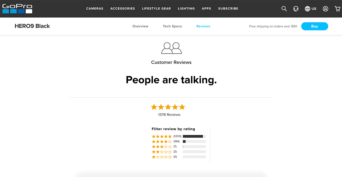
If the biggest companies in the world are using testimonials and persuasion, so should you. Was your product featured by a prominent website or did it win an award? Put that in your main copy. Do you have a well-known client or famous customer? Show images of them using it or ask them for a testimonial.
Now you’ve brought them into your world and they trust you. Next comes the tricky part.
Everyone wants something. The trick is to make them want what you’ve got.
Give someone a small taste of something, and it makes them hungry for more. We are born curious. By teasing this basic human urge, you can make users click on just about anything.
Amazon does this really well when selling books. They use an irresistible catchphrase above the book image that simply says: “Click to look inside!”
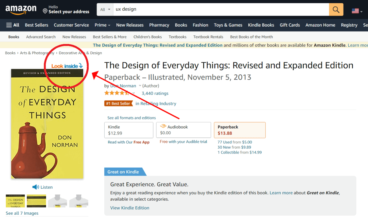
You can’t help but click it!
If you’re selling a product or service, give users just enough information to tease them. Give them that psychological urge to learn more. Then show them where to go to satisfy the craving.
I used this trick at the beginning of the article. I told you I had already used psychology on you, and it made you want to keep reading, right? And now you’re here. Curiosity always works.
Just make sure this technique doesn’t backfire. The payoff must be as good as your promise. If it sucks, you turn a good user experience into a bad one.
You do this when you teach a pet new tricks; it’s called conditioning. Whenever your users do what you want, reward them! And they’ll do it again. And again.
You can learn a lot from Facebook here. Facebook wants you to share as much as possible. It’s what keeps them going. So, they reward you with likes. Every time you get a ‘like’, you get a small hit of happiness. It feels good, so you do it again. You keep sharing.
If you’ve got a product to sell, reward people when they buy it. Offer them a discount on their next purchase. Identify the main conversion goal for your site, and reward people for doing it.
By understanding the basic psychological urges of your users, you can make an emotional connection with them. When you’ve done that, you can make them do just about anything you want.
Plus – you’ve reached the end of this guide!
We hope you’ve enjoyed learning all about UX design and how to apply it to your website. If you follow through, you’ll be guaranteed to see transformational results.
Make sure you check out the rest of our articles on how to keep optimizing your website and making it the best it can be.
Daren Low is the founder of Bitcatcha.com. With over a decade’s experience in website development and internet marketing, Daren is a top authority on anything to do with building and managing an online business. Pick his brain today by connecting via Linkedin and Twitter.

